Tweaking figures#
Most of the customization typically needed when exploring and visualizing your data is covered by the keyword arguments illustated in the line-plot and image-plot notebooks. However, getting figures ready for publication often requires more fine-grained tuning.
[1]:
%matplotlib inline
import scipp as sc
import plopp as pp
import numpy as np
import matplotlib.pyplot as plt

da = pp.data.data1d()
Basic modifications#
Changing axes labels#
By default, Plopp will add labels on the horizontal and vertical axes to the best of its knowledge.
[2]:
p = pp.plot(da)
p
[2]:

To change the label of the vertical axis, use the .canvas.ylabel property on the plot object:
[3]:
p.canvas.ylabel = 'Phase of sound wave'
p
[3]:

Adding a figure title#
To add a title to the figure, use the title argument:
[4]:
pp.plot(da, title='This is my figure title')
[4]:

Setting the axis range#
Vertical axis#
Changing the range of the vertical axis is done using the vmin and vmax arguments (note that if only one of the two is given, then the other will be automatically determined from the data plotted).
[5]:
pp.plot(da, vmin=sc.scalar(-0.5, unit='m/s'), vmax=sc.scalar(1.5, unit='m/s'))
[5]:

Note that if the unit in the supplied limits is not identical to the data units, an on-the-fly conversion is attempted. It is also possible to omit the units altogether, in which case it is assumed the unit is the same as the data unit.
Horizontal axis#
The easiest way to set the range of the horizontal axis is to slice the data before plotting:
[6]:
pp.plot(da[10:40])
[6]:

Note that this will add some padding around the plotted data points.
If you wish to have precise control over the limits, you can use the lower-level canvas.xrange property:
[7]:
p = da.plot()
p.canvas.xrange = [10, 40]
p
[7]:

Note that camvas.yrange is also available, and is equivalent to using the vmin and vmax arguments.
Further modifications#
Instead of providing keyword arguments for tweaking every aspect of the figures, we provide accessors to the underlying Matplotlib Figure and Axes objects, that can then directly be used to make the required modifications.
Tick locations and labels#
To change the location of the ticks, as well as their labels, we directly access the Matplotlib axes via the .ax property of the figure:
[8]:
p = da.plot()
p.ax.set_yticks([-1.0, -0.5, 0, 0.5, 1.0])
p.ax.set_yticklabels([r'$-\pi$', r'$-\pi / 2$', '0', r'$\pi / 2$', r'$\pi$'])
p
[8]:

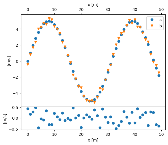
Axes placement#
To control the exact placement of the axes, it is best to first create the axes manually with Matplotlib and then attaching the Plopp figure to them via the ax argument.
[9]:
a = pp.data.data1d() * 5.0
b = a + sc.array(dims=a.dims, values=np.random.random(a.shape[0]) - 0.5, unit=a.unit)

fig = plt.figure(figsize=(5, 4))
ax0 = fig.add_axes([0.0, 0.2, 1.0, 0.8])
ax1 = fig.add_axes([0.0, 0.0, 1.0, 0.2])

ax0.xaxis.tick_top()
ax0.xaxis.set_label_position('top')
ax1.set_ylabel('Residuals')

p1 = pp.plot({'a': a, 'b': b}, ax=ax0)
p2 = pp.plot(a - b, ax=ax1)
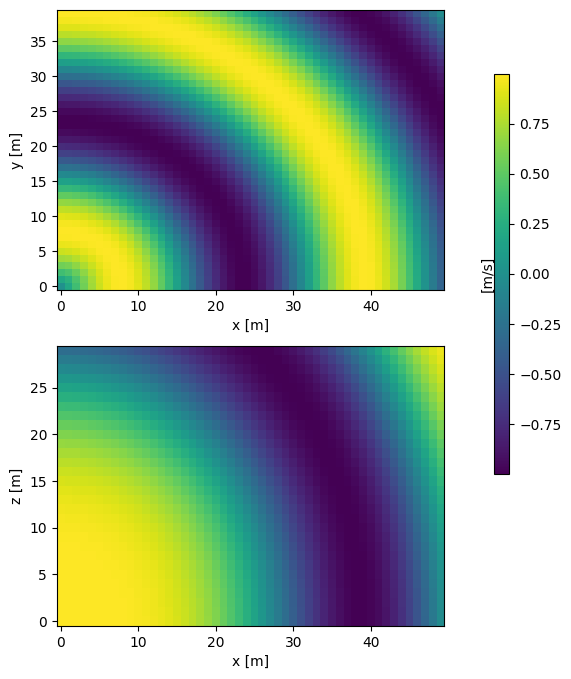
It is also possible to control the placement of the colorbar for image plots using the cax argument:
[10]:
da = pp.data.data3d()

fig, ax = plt.subplots(2, 1, figsize=(5, 8))
cax = fig.add_axes([1.0, 0.3, 0.03, 0.5])

pz = pp.plot(da['z', 0], ax=ax[0], cax=cax)
py = pp.plot(da['y', -1], ax=ax[1], cbar=False)