Customizing figures
Contents
Customizing figures#
Sometimes, even though relatively customizeable, the plot method of scipp is not flexible enough for one’s needs. In this section, we explore how the figures produced by the scipp.plot function can be further modified.
Modifying the returned Plot object#
There are two ways of customizing scipp figures. The first one is to first create a default figure using the plot function, and then modifying its contents.
The plot commands returns an object which is represented in a notebook as a figure (or multiple figures) using the _ipython_display_ property. This object can subsequently be modified post-creation.
[1]:
import matplotlib.pyplot as plt
import numpy as np
import scipp as sc
%matplotlib widget
[2]:
N = 60
M = 5
d = sc.Dataset()
d['noise'] = sc.Variable(dims=['x', 'tof'], values=10.0*np.random.rand(M, N))
d.coords['tof'] = sc.Variable(dims=['tof'],
                              values=np.arange(N+1).astype(np.float64),
                              unit=sc.units.us)
d.coords['x'] = sc.Variable(dims=['x'], values=np.arange(M).astype(np.float64),
                            unit=sc.units.m)
out = sc.plot(d, projection="1d")
out
[2]:
The out object is a Plot object which is made up of several pieces: - some widgets that are used to interact with the displayed figure via buttons and sliders to control slicing of higher dimensions or flipping the axes of the plot - a view which contains a figure and is the visual interface between the user and the data - in the case of 1D and 3D plots, the Plot object also contains a panel which provides additional control widgets
Each one of these pieces can individually be displayed in the notebook. For instance, we can display the widgets of the 2D image by doing
[3]:
out.widgets
[3]:
and they are still connected to the figure above.
It is also possible to customize figures such as changing the figure title or the axes labels by accessing the underlying matplotlib axes:
[4]:
out.ax.set_title('This is a new title!')
out.ax.set_xlabel('My new Xaxis label')
out
[4]:
A line color may be modified by accessing the underlying axes and lines using the Matplotlib API (although we do recommend that changing line styles should instead be done by passing arguments to the plot command, as shown here):
[5]:
out.ax.get_lines()[0].set_color('red')
out
[5]:
Note
If the plot produces more than one figure (in the case of plotting a dataset that contains both 1d and 2d data), the out object is a dict that contains one key per figure. The keys are either a combination of dimension and unit for 1d figures, or the name of the variable (noise) in our case.
Placing figures inside existing Matplotlib axes#
Sometimes, the scipp default graphs are not flexible enough for advanced figures. One common case is placing figures in subplots, for example. To this end, it is also possible to attach scipp plots to existing matplotlib axes.
This is achieved via the ax keyword argument (and cax for colorbar axes), and is best illustrated via a short demo.
We first create 3 subplots:
[6]:
figs, axs = plt.subplots(1, 3, figsize=(12, 3), dpi=96)
Then a Dataset with some 2D data:
[7]:
N = 100
M = 50
xx = np.arange(N, dtype=np.float64)
yy = np.arange(M, dtype=np.float64)
x, y = np.meshgrid(xx[:-1], yy)
b = N/20.0
c = M/2.0
r = np.sqrt(((x-c)/b)**2 + ((y-c)/b)**2)
a = 10.0 * np.sin(r)
d1 = sc.Dataset()
d1['Signal'] = sc.Variable(dims=['y', 'x'], values=a, unit=sc.units.counts)
d1.coords['x'] = sc.Variable(dims=['x'], values=xx, unit=sc.units.m)
d1.coords['y'] = sc.Variable(dims=['y'], values=yy, unit=sc.units.m)
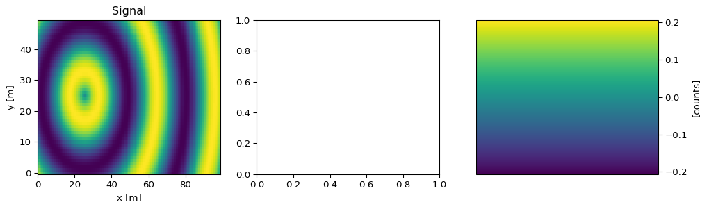
Next, we attach the 2D image plot to the first subplot, and display the colorbar in the third subplot:
[8]:
out = sc.plot(d1, ax=axs[0], cax=axs[2])
This has just returned a Plot object, but then we can check that our original figure has been updated:
[9]:
figs
[9]:
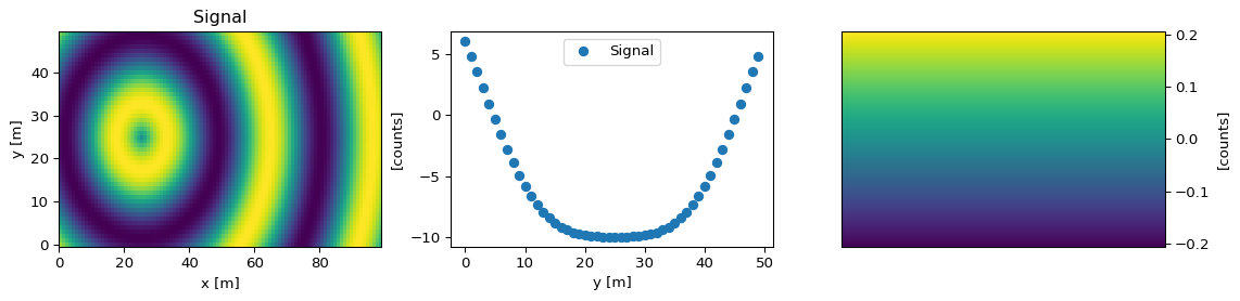
We can add a 1D plot of a slice through the 2D data in the middle panel, and check once again the original figure:
[10]:
out1 = sc.plot(d1['Signal']['x', 1], ax=axs[1])
figs
[10]:
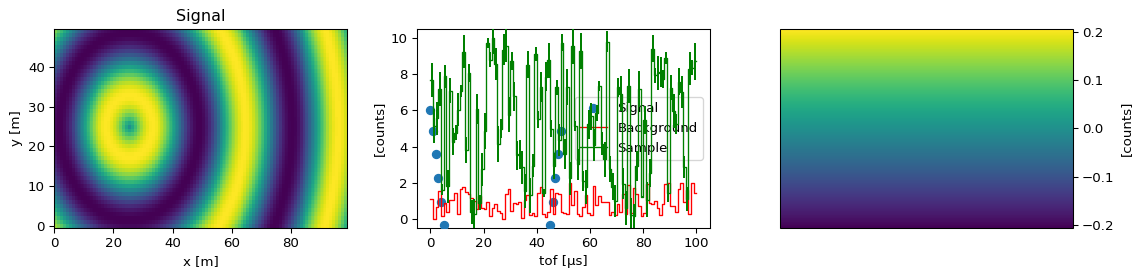
Next we create a second dataset with some more 1D data and add it to the middle panel:
[11]:
d2 = sc.Dataset()
N = 100
d2["Sample"] = sc.Variable(dims=['tof'],
                           values=10.0 * np.random.rand(N),
                           variances=np.random.rand(N),
                           unit=sc.units.counts)
d2["Background"] = sc.Variable(dims=['tof'],
                               values=2.0 * np.random.rand(N),
                               unit=sc.units.counts)
d2.coords['tof'] = sc.Variable(dims=['tof'],
                               values=np.arange(N+1).astype(np.float64),
                               unit=sc.units.us)
out2 = sc.plot(d2, ax=axs[1], color=['r', 'g'])
figs
[11]:
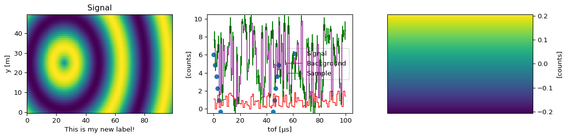
We can now for example modify the axes labels:
[12]:
axs[0].set_xlabel('This is my new label!')
figs
[12]:

You can then also access the individual plot objects and change their properties using the Matplotlib API. For example, if we wish to change the line color of the 'Sample' from green to purple, we can do:
[13]:
axs[1].get_lines()[2].set_color('purple')
figs
[13]: